
CASE STUDY
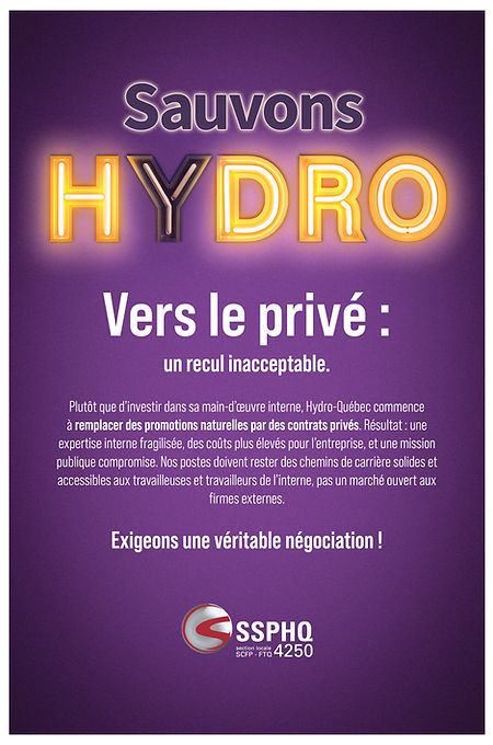
Sauvons Hydro
Awareness campaign
CONTEXT
The Syndicat des spécialistes et professionnels d'Hydro-Québec (SSPHQ) faced a deadlock in negotiations with the employer.
To move beyond the internal framework of the conflict, the union wanted to position the situation as an issue of collective interest to the general public.

OBJECTIVES
The campaign was designed to meet several objectives:
Clarifying the issues for the general public
Raising awareness of the risks associated with management decisions
Highlighting the potential impacts on public services
Generate support for the union's approach
APPROACH
Strategic thinking led to the identification of a simple, direct, and mobilizing communication strategy. The challenge was to transform a complex issue, linked to the management, negotiations, and structure of a state-owned company, into a message accessible and understandable to the general public.
The approach chosen is based on creating a strong message, capable of quickly capturing attention and generating an immediate reaction.

SOLUTION
Develop a multi-platform campaign around the Sauvons Hydro concept, a deliberately simple, direct, and urgent message, built on contrasting neon-style typography that evokes both energy and fragility.
Deployed across billboards, digital visuals, and union communication tools.
RESULT
The campaign helped sustain member mobilization. In January 2026, the 5,500 members of the SSPHQ voted 87% in favour of ratifying a new five-year collective agreement.